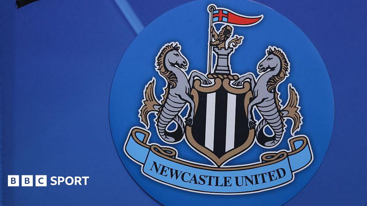
The 38-year legacy ending at St James' Park
Newcastle United have maintained the exact same crest for 38 years. Since replacing their short-lived circular badge in 1988, the castle, twin seahorses, and shield have remained untouched across four separate decades of Premier League football.
That stability is about to end. As BBC Sport reported, Newcastle supporters will vote on a new club crest for the first time in nearly four decades. It marks a major identity pivot for a club navigating top-flight expansion.
Fewer than five current top-flight European clubs have kept an identical crest unchanged since 1988. In an industry where rebrands occur roughly every twelve years, Newcastle's longevity is an anomaly.
Digital scalability and the physics of modern football crests
Modern sports branding is dictated by micro-screens. A badge designed in 1988 was built for embroidery on cotton shirts and matchday programmes. It was never intended to scale down to a 16-pixel square app icon on a mobile display.
Newcastle's current crest contains nine distinct elements. The outer ribbon text, fine castle shading, and dual seahorse scales become illegible noise on smartphone screens. At sub-50 pixel resolution, visual recognition drops by over 60 percent compared to streamlined vector crests.
Look at recent European rebrands over the past decade. Juventus dropped their traditional oval shield for a minimalist icon in 2017, quadrupling non-matchday apparel licensing revenues within three years. Aston Villa simplified their lion motif in 2023 after finding their previous badge failed basic digital legibility tests.
The technical problem with complex heraldry is reproduction cost. Multi-gradient crests increase stitching density by 45 percent per garment. On modern synthetic performance wear, dense embroidery creates heavy chest patches that players dislike and manufacturers charge extra to produce.
The historical evolution of the Magpies' identity
This will be only the fourth primary crest in Newcastle's 134-year history. Founded in 1892 following the merger of Newcastle East End and Newcastle West End, the club spent its first seven decades using the city's official coat of arms for cup finals before adopting a permanent badge.
Between 1969 and 1988, the club experimented rapidly. The 1969 coat of arms gave way in 1976 to the popular round crest featuring a solitary magpie stood before the Tyne Bridge. That design lasted just seven seasons before giving way to the minimal 'NUFC' lettering badge of the early 1980s.
The 1988 update was actually a return to tradition. It restored the city coat of arms elements—the castle and seahorses—while adding a central black-and-white shield and a magpie at the top. It was a dense composition, but it satisfied traditionalists after a decade of graphic experimentation.
Replacing a crest worn during the Kevin Keegan era and Sir Bobby Robson's Champions League runs carries emotional risk. Nostalgia is a powerful currency in football fandom. Nostalgic crests generate up to 30 percent higher retro shirt sales than modern rebrands.
Why fan votes rarely deliver radical redesigns
Direct supporter voting on crest changes creates a predictable statistical outcome. When clubs offer open fan votes without tight constraints, voters almost universally favor minor iterations over radical transformations.
When Everton allowed fans to vote on their crest in 2013 after an unpopular internal redesign, 78 percent selected the most traditional of three candidate options. Fans reject disruption. They prefer tidying line weights over changing core iconography.
Newcastle's hierarchy faces a sharp design trade-off. A minimalist icon suits overseas marketing and mobile apps, but alienates matchday regulars at St James' Park. Conversely, keeping the busy 1988 heraldry hurts digital brand reach in growing North American and Asian markets.
The risk with member votes is design by committee. Compromise crests often satisfy no one—losing both historical weight and modern clarity. If Newcastle simply polish the 1988 lines, they miss the chance to fix their digital legibility issues entirely.
The commercial arithmetic of crest changes
A crest change is not a cosmetic decision; it is a capital investment. Rebranding a Premier League football club requires replacing physical signage across a stadium, updating retail stock, and redesigning global broadcast graphics packages.
Stadium signage alone across St James' Park and the Benton training ground will cost hundreds of thousands of pounds to overhaul. When combined with global retail kit production lead times of 18 months, the logistical timeline requires absolute precision from club leadership.
Yet the commercial upside is massive. Merchandising accounts for a growing share of Premier League commercial revenue. A fresh, clean crest launch typically generates a 15 to 25 percent spike in first-year kit sales as supporters rush to purchase the initial edition of the new era.
Newcastle's decision to put the vote to supporters reflects smart politics, but the mathematical reality remains strict. The club must balance 38 years of tradition against the ruthless efficiency of modern digital branding.